Bailout Pie Chart and "Inconceivable..." below are part of a post by Barry L. Ritholtz 03 Dec 08 as "More Bailout Comparisons" from his blog The Big Picture.
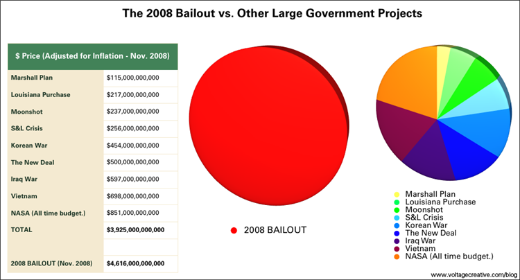
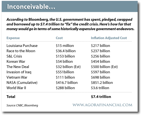
Original pie chart from the Voltage Blog under "Scary Bailout Money Info Graphic." This one is only comparing $4.6 trillion. The second one is from Bloomburg via Agora Financial, which makes comparisons that add up to $7.4 trillion.